Uniting, promoting and facilitating
Logo and documentation development for a well-regarded association who underwent a name-change.
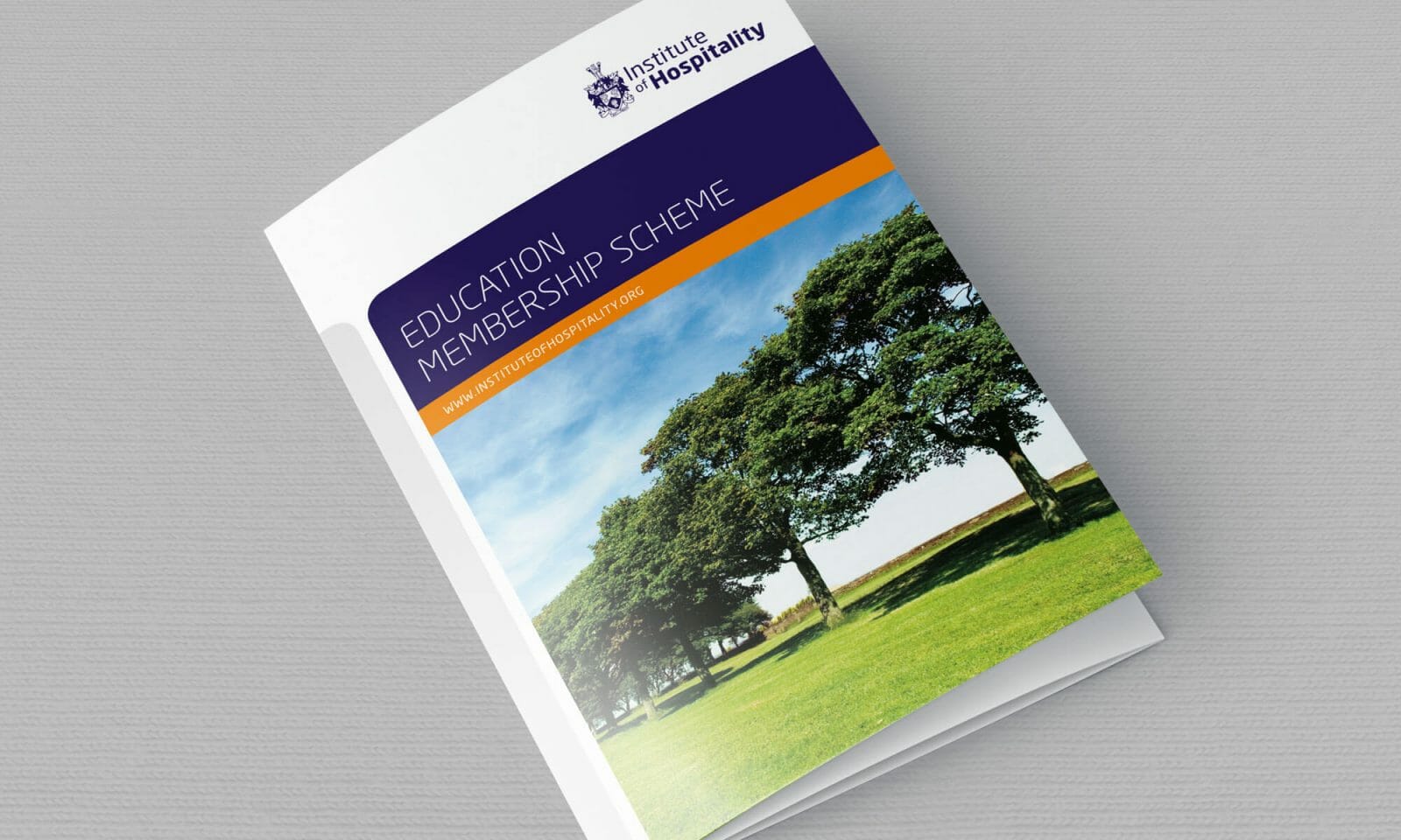
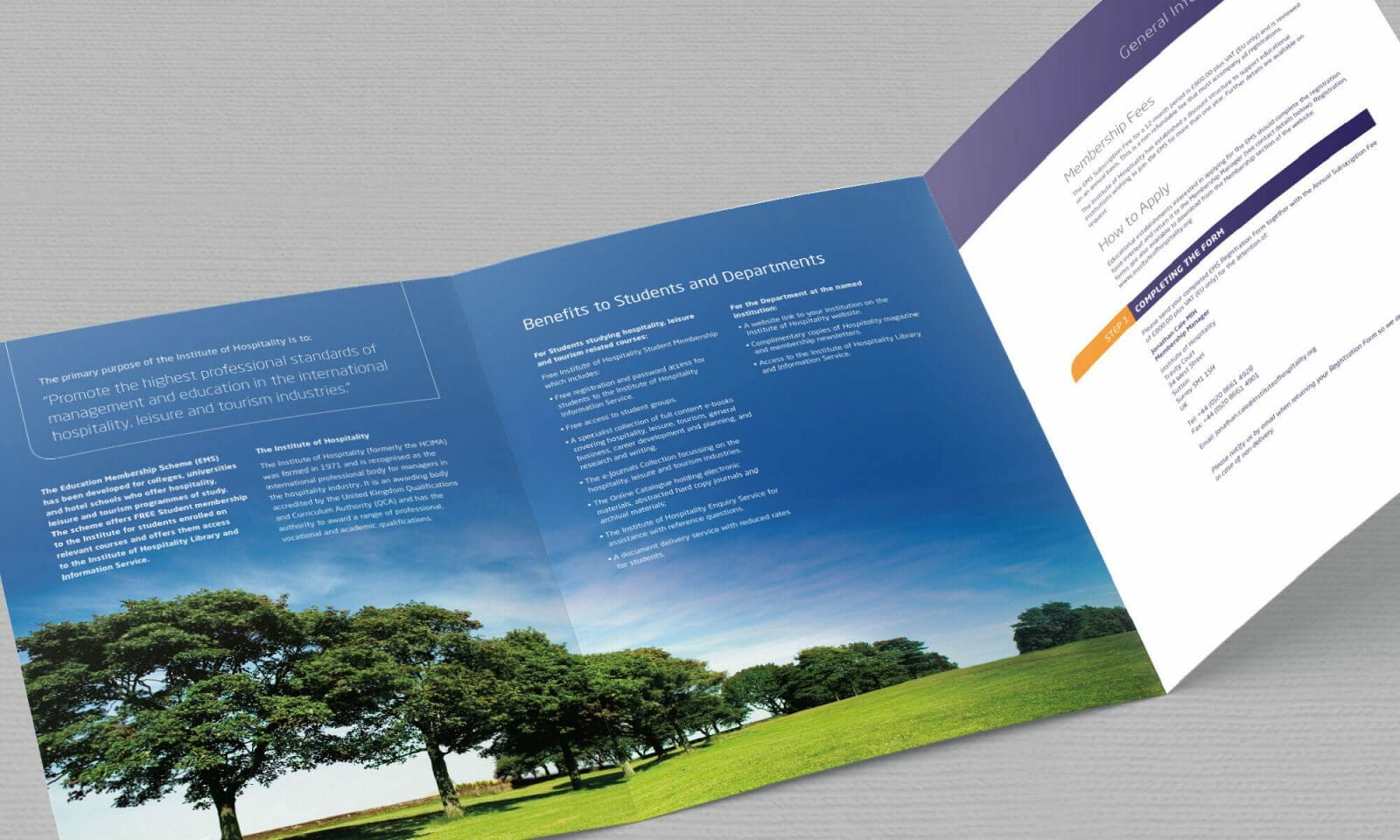
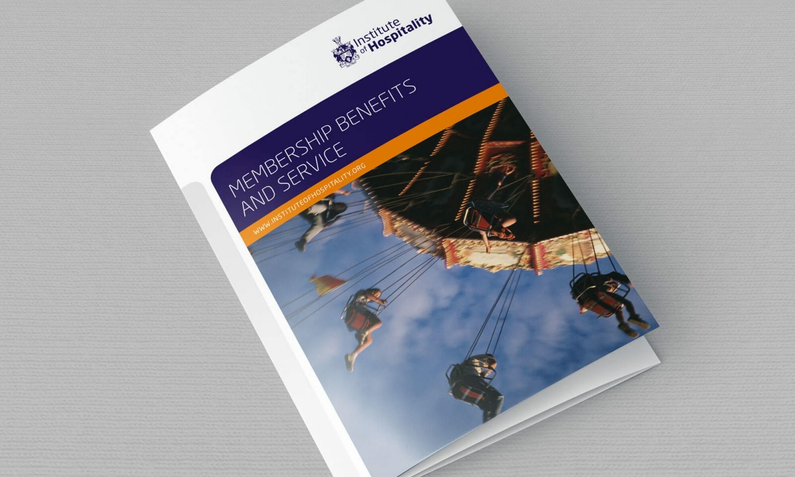
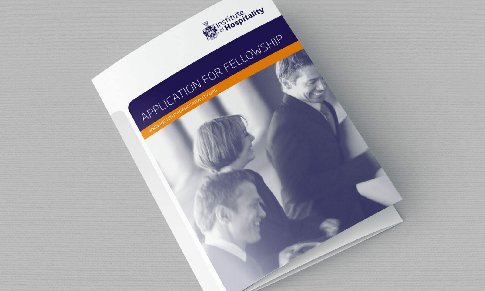
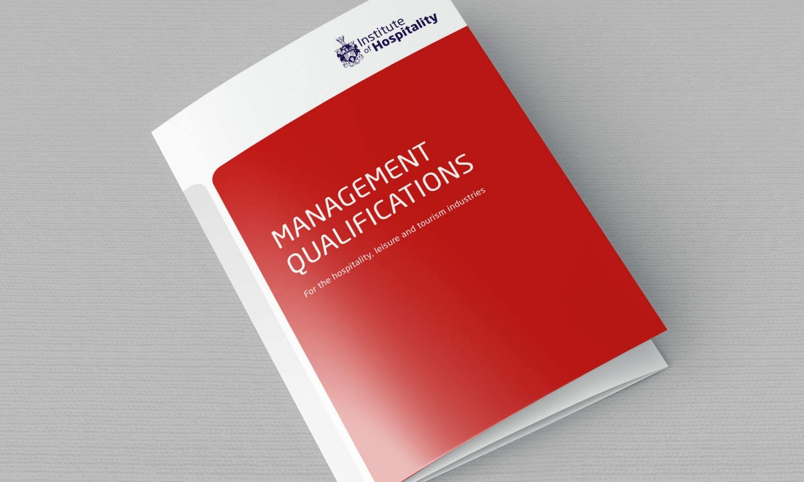
Hospitality association corporate identity
The Institute of Hospitality is the professional body for individual managers and aspiring managers working and studying in the hospitality, leisure and tourism (HLT) industry.
Formerly known as the HCIMA – whom I had created an identity for a few years earlier – they implemented a name change to the Institute of Hospitality. The resulting need for a rebrand was more of an evolution of existing materials to a more contemporary and open style.
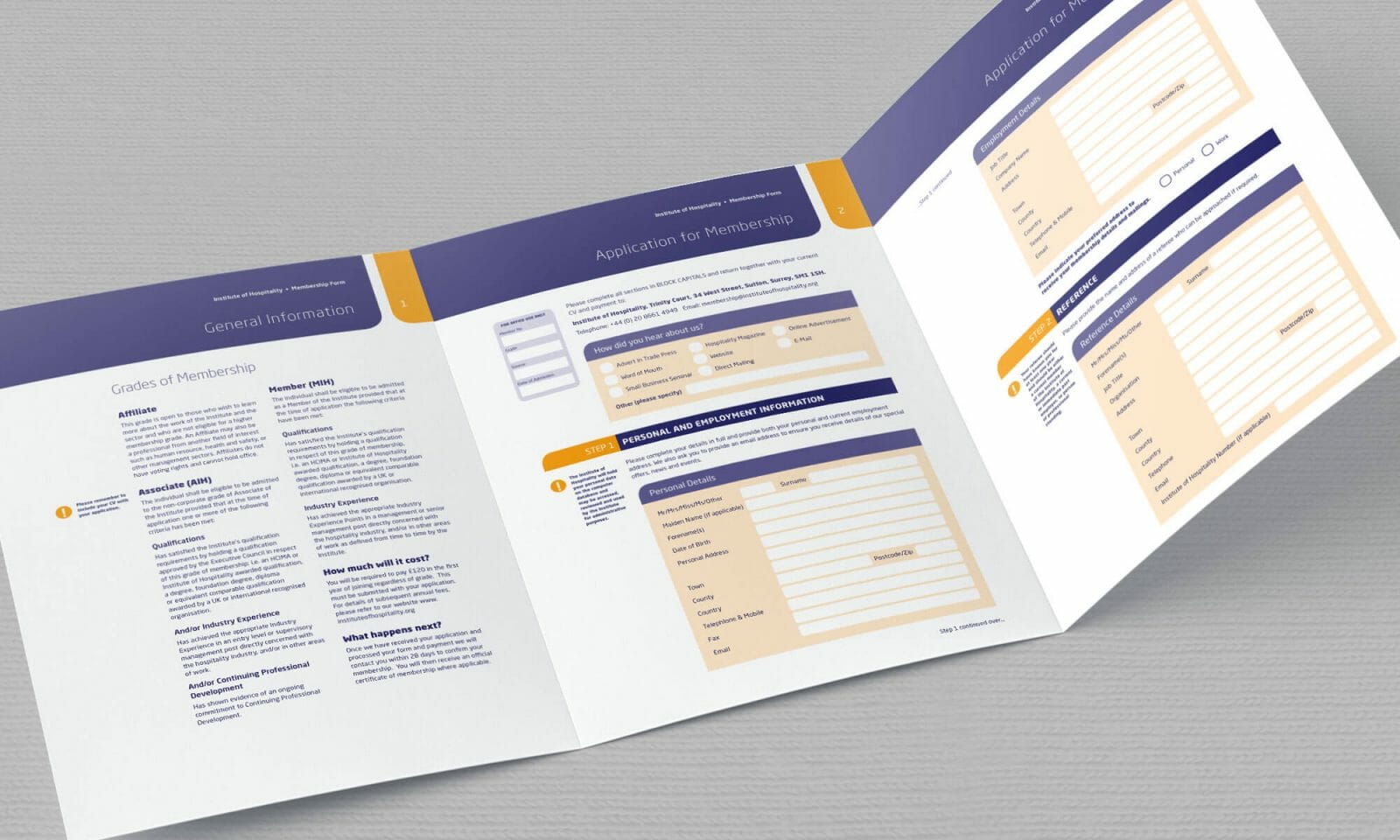
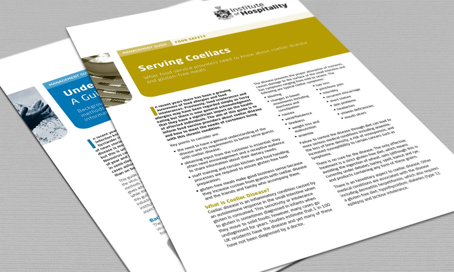
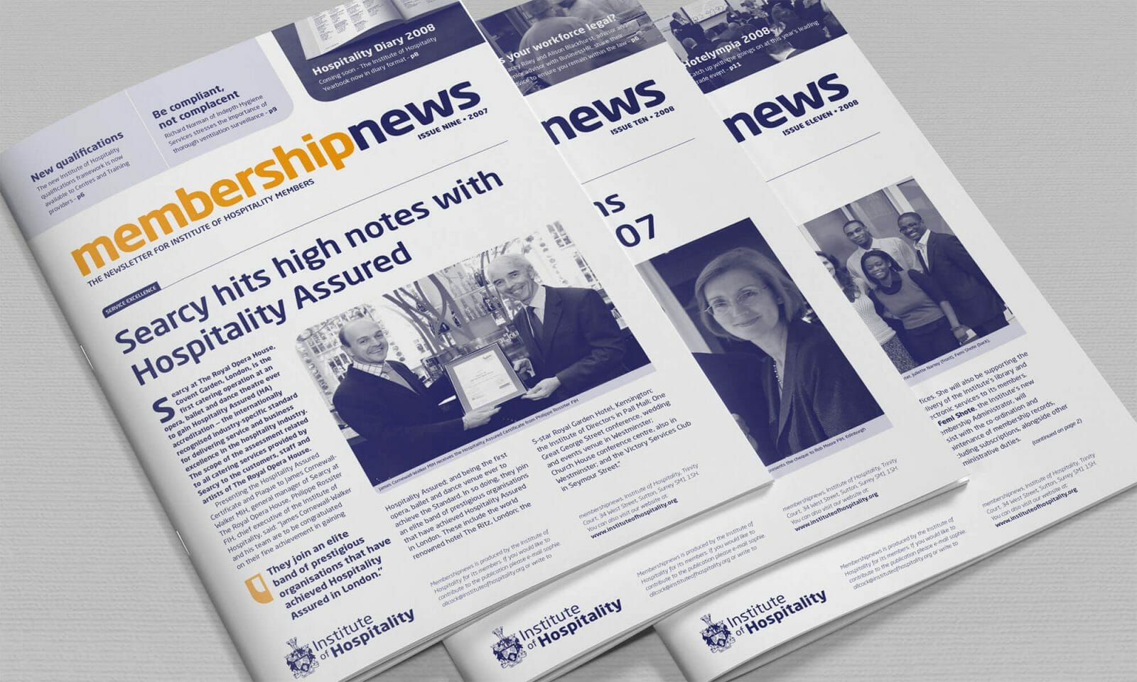
The logo retained its crest from the previous incarnation but the Gill Sans typography replaced by Neo Sans – a modern and flexible typeface with many weights. The name was rendered in contrasting weights and sizes to give a more dynamic feel. This typeface was also used as a brand device throughout its publications alongside retaining its distinctive orange and blue colour scheme from the previous HCIMA identity.
Subsequent refinements to the covers and internal layout of various leaflets, forms and newsletters took place with the introduction of rounded corners and the use of a fresher grey tint on the left side.
ClientInstitute of HospitalityServicesDesign, Art Direction, Document Strategy